Sacred Cow Barbecue Illustration in This Month's Game Informer Magazine!

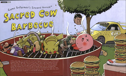
This month we drew an illustration for Game Informer Magazine, the best dang video game magazine out there, for the article "Sacred Cow Barbecue". In this article, the editors finally cut loose on some classic games that no one (until NOW) had the cajones to take down a peg.
Half-Life, Chrono Trigger, Smash Bros, NFL 2K5, Gran Turismo, Rez, and even good old GoldenEye get the bum's rush. And I tell you what, nothing is as fun to draw as Nintendo characters grilling up to a golden brown.
One thing that was different about this image was that we delivered the work in six different Photoshop layers. This was because last year, the designers wanted to take parts of the illustration and use them on subsequent pages of the article to break up the text a little. Doing the drawing this way was kind of fun and interesting-- being a double-page spread, it worked out better to draw all the elements separately since we don't have any paper around here big enough to do the entire illustration on. Also, when working for clients (even clients as easygoing as Game Informer), it's good to design in a good deal of adaptability to your drawing-- in this case, the ability to move elements around all the way until the end of the process.
That said, the intention was that the drawing be reproduced like the Original Image mentioned above, going across two pages, and leaving space at the bottom for some introductory text. On the next couple pages, they could then take elements and scatter them around to illustrate some of the individual games with their particular image. What they did, however, was split the drawing up entirely, and put two whole layers on the following page, which I think was pretty successful; it draws a lot of attention to the grill with the Nintendo characters on it, it clones the Rez burger and makes that more prominent, and it makes the initial page's layout less symmetrical and more dynamic. It loses some of the depth that the original illustration had, but I don't think that's that big of a deal. It also allows the second page to have a good corner-oriented illustration that gives that spread an attractive look. Pretty tricky how they switched around that crowbar. Nice one, guys.
The little details that went into this (as opposed to the kind of obvious characters-being-barbecued details) are the partially-obscured "BTA" on the car's hood, mimicking the Gran Turismo logo, the "GIO" which is meant to look like "GTO" but stand for "Game Informer Online", and "Hodges" on the top of the car, which is a name-check to Paul Hodges, a friend of mine who played a lot of Gran Turismo back in the day.
Anyway, check out the images and see what you think. You can also read the article, which doesn't seem to be available online-- hopefully that's cool with GI.

3 Comments:
Great work. It's a damn shame they didn't just use the original art, but I could see why they felt the need to change it to make room for the text.
pauvre bond
Doc-- Yeah, I don't love it when people change my/our work, but I was surprised at how well it worked in general. This sort of drawing, being gag-related, is easier to mess with too. For all intents and purposes, I turned in 6 gag drawings (but...was only paid for one! Hey!).
Post a Comment
<< Home