Monday, April 30, 2007
MicroCon 2007
Gorgeous spring weather didn't stop thousands of comics fans from descending on the Minnesota State Fairgrounds on Sunday. MNCBA hosted its annual springtime MicroCon (the little sister of the two day FallCon ... which is in the fall), and as usual it was a cavalcade of local and regional creators, comics and toy vendors, and costumed superheroes walking around, posing for photos.
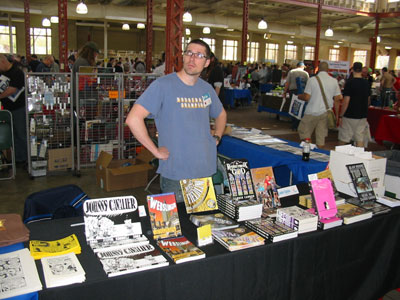
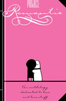
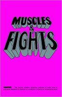
Zander and I had a choice table right up front. Our hot items for this con were our two new "pink" anthologies. Project: Romantic has been around for awhile, but this Eisner-nominated book was new to most people we talked to (After flipping through the book, Sherwin Schwartzrock called it the greatest anthology he'd ever seen. He did not purchase a copy, however.) Our other pink book was the Muscles and Fights anthology which reprinted this Versus cartoon. We're hoping that Bud Burgy will put together a second volume, titled, perhaps, "Drinks and Finks" (hard-drinking scoundrels) or "Punches and Hunches" (heavy-fisted detectives).
 |  |
Most of MicroCon Zander and I were chatting it up with folks, but here are some sketches I was able to slip in (click for a larger version).
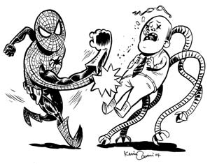
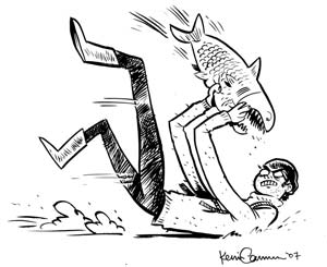
Thus begins Con Season for the Attic. Look for us at MoCCA in June, San Diego in July, Chicago in August, and back at the State Fairgrounds in the fall.
Labels: Conventions, Friends of BTA
Friday, April 27, 2007
Influences: Official Handbook to the Marvel Universe
This will seem a bit silly, but one thing I loved as a pre-teen was not necessarily READING the Official Handbook to the Marvel Universe, but knowing that it existed. I really enjoyed the fact that every little character that showed up in Marvel Comics had an entry that talked about their history, origin, first comic appearance, strength level, hair color, base of operations, other aliases, and whether people know his or her secret identity.
Having that attention to detail in a world that is entirely in people's minds was a fantastic thing to me, and it made it seem, if not real, then at least consistent (which it probably wasn't, entirely). If you're going to escape into another universe, it might as well be a cool, well-populated one, right?
But possibly the best part of the whole thing was the covers of the deluxe edition of the series. Click on the thumbnail below to see the image (Warning-- It is 2.88 MB.)

Note in particular Mr. Fantastic's arm which spreads across something like ten issues, and the fact that the last cover leads right into the first again. Pretty cool for me as a teenager.
Labels: Influences
Thursday, April 26, 2007
Old-Timey Comics: Apt 27
Sadly there's no Chapter 99 comic this week. So as filler, here's a an old comic I did way back in '02.
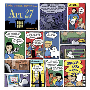
* Click for Larger Image *
Labels: Online Comics
Wednesday, April 25, 2007
I Wish Someone Would Invent: An All-Book MPR Station
I am fortunate to live in the great state of Minnesota, which boasts the best public radio system in the country. For you out-of-towners, Minnesota Public Radio (MPR) is a three-headed [loveable] beast: 91.1 KNOW is non-stop news and information (except for Saturday night, which is a newsless black hole of Prairie Home Companion and jazz), 99.5 KSJN plays classical music and broadcasts the Met opera every Saturday afternoon, and 89.3 the Current is like listening to your cool friend's iPod.
As a cartoonist, I cannot express how grateful I am to these stations for existing, as they provide a hands-free soundtrack to my life while I work. However, they've spoiled me, and the spoiled child always wants more. When I was in high school, I used to tune in Sunday nights to 91.1 because they'd air book readings and short stories, which I found extraordinarily relaxing. Way back then I began dreaming of another MPR station, one that would play 24 hours of people reading stuff. I know that books on tape exist, but I'd honestly much rather make someone else do the work of picking out and airing the readings. Plus, books on tape are so limited compared to the possibilities of a public radio station dedicated to reading: live poetry slams, authors reading their short stories, old scratchy recordings of Dylan Thomas and T. S. Eliot, ... etc.
I can't imagine that anything like this station would be able to get off the ground, but it's fun to think about. Here's my imaginary line-up for a typical weekday:
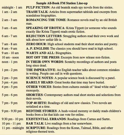
And of course, Garrison Keillor would pop in a few times a day to give us an update on authors' birthdays and remind us how important it is to turn the radio off once in a while and actually go to a library or bookstore.
Labels: I Wish Someone Would Invent
Tuesday, April 24, 2007
Tips and Tricks: Cheating with Perspective
Every art student at one point or another learns to draw in one- or two-point perspective, and depending on how long you study it, it can get pretty overwhelming. Drawing out every line to the horizon and mapping out how far apart evenly spaced things are from one another as they recede-- it's exhausting! And worst of all, the mathematical precision of really doing the perspective right is almost always (particularly if you are imprecise, like I am) runs counter to your intuitions about aesthetically pleasing panel layouts.
Now, certainly there are times in which you have to really do it right. Cityscapes, roads, massive shelves of books, cars, etc., those panels all really need you to take some time and figure it all out. But what we're talking about today is the other 85% of the time-- when all you need is for things to look right enough. That's where the cheating comes in.
Getting perspective right can be a thankless job. If you nail it, no one notices, but get one thing wrong and your whole panel goes kerflooey. What we need to do is make a believable environment without having to get out the yardstick.
One: The Horizon Line is Eye Level
When you're drawing a lot of panels and you want to keep them looking basically structurally sound, one of the best things you can remember is this one simple fact: the horizon line is eye level. If you are looking horizontally, and you will find that most comic panels more or less are, the horizon line is at your eye level, and so it will cross everything at that level. Say you are 5'6". The horizon line will cross everything in the panel at five feet. Is someone much taller than you? Then it crosses them at the chest. A building in the background? About 3/4 the way up the door. A hobbit? Way above their head.
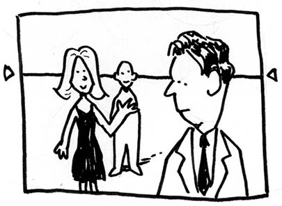
But apart from a few outliers, most people in a crowd scene, for example, will have their heads more or less right on the horizon line. This is helpful from a layout point of view because then all of the people's heads that you need to look at are lined up neatly in a row, anchoring the panel and making it much easier to read.
Two: Don't Worry About the Vanishing Point
Perspective books always talk about the vanishing point, and while that's important if you want your perspective to be bang on perfect, what I find is more useful on a daily basis is just worrying about whether things go basically up or down as they recede into the distance. If they are above the horizon line (eye level, remember), they will go down as they recede. If they are below it, they go up.
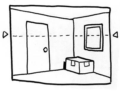
When drawing a room interior like this one, in my experience, it can be counterproductive to really extend the lines all the way to the horizon, which would put the vanishing point way off the page. I like to instead just imagine the angles of horizontal lines on the wall as simply getting shallower as they come toward the horizon. The picture on the wall, for example, has its lines going in the same directions as the top and bottom of the wall, just less extreme.
You'll notice I didn't use a ruler for this panel. Some people would be horrified, but I find that it's so much easier to do it like this than by ruling it out. Besides, once you start ruling things, everything that's not ruled starts looking bad, and you have to make every line straight, and every oval perfect, and quite honestly, then you will want to quit and go play video games.
Three: Putting It All Together (And A Trick!)
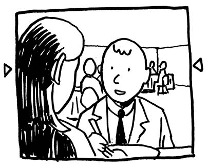
You will find that anchoring your people and objects to a horizon line will immensely improve your panel layouts. People will look much less like they are floating around, and two people talking will look very engaged in what they are doing, rather than two images just cut and pasted into the same panel. Also, a scene which has a horizontal line of people that are more-or-less the same height going across it can have a similar calming effect to a panel with an actual horizontal line, which is nice if you want a scene to be relaxed, despite having a bunch of people in it.
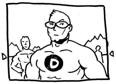
One trick that is used very often to great effect is drawing heroic characters from a low point of view; that is, putting the horizon line at about their chest level, as if we were only about 80% of their height. Now, when you see one single character like this, with no background or other characters around him, you don't really get the effect, but as soon as you put in some other people, or background, you really get it. That guy's big!
Four: Testing your work.
Much like all things with comics, the best way to test your perspective is, first of all, does it look right to you? Second, does it look right to your friends? Third, does it look right to an art teacher or professional artist? Fourth, does it look right to Gene Ha? If the answer to any of the first three are no, then you should definitely fix it right away. If it's the fourth, well, then you've probably been following this guide to a T.
Five: A Few Other Cheats
Models: A few good plane and car models are nice to have around-- even Matchbox cars are pretty useful, considering how cheap they are. Sometimes it's useful to take a photograph of them from the right point of view and work from that, as it makes it easier to get the perspective right.
Photographs: Can't beat 'em, if you're drawing the same building from the same perspective. Do that too much, or from photographs that you didn't take, however, and people will notice.
Sketchup: Google Sketchup is a fantastic free 3D modeling tool that allows you to create environments relatively easily and then texture them, light them, and rotate them to get just the angle you need. You can also download models people have created of buildings, cars, and anything else you need to get just right. It's cheating at its very best!
Labels: Tips and Tricks
Monday, April 23, 2007
Saturday, April 21, 2007
Far Arden: Chapter Seven
This chapter's all about deteriorating relationships.... So put on some Bright Eyes, pour a glass of wine, and enjoy the arctic waterworks:
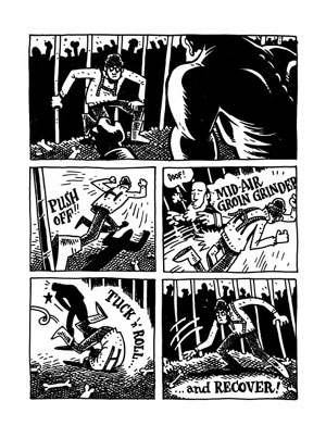
Read Chapter Seven.
Start from the beginning.
Labels: Far Arden, Online Comics
Friday, April 20, 2007
Influences: David Mazzucchelli
I've mentioned David Mazzucchelli before, but I can't really state strongly enough how much I admire his work and how much I looked at it (particularly in Batman: Year One) as the absolute epitome of thrilling, dramatic comics.
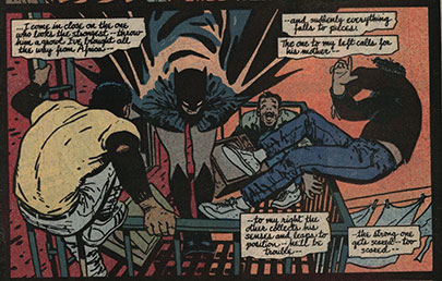
The most exciting thing to me about his artwork was the fact that there was literally not one more line than was needed to get the point of the panel across. No extra hatching on faces, no extra detail in backgrounds. You could read every panel in seconds, but it nonetheless slowed the eye down to tell the story at the right pace.
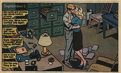
This panel is a perfect example. Every detail serves the story. From the open filing cabinet drawer to the file dropped on the ground, and the photo of his wife on the desk, there is no need for the captions to say anything about what is actually happening. The image tells you the whole story, and any words can address what is not in the picture. It's night, and she's requesting a transfer. Beautiful.
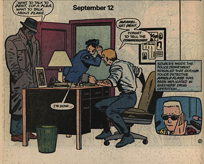
Mazzucchelli's willingness to leave out panel borders and let the page breathe is something that I never really caught onto when I was younger, but looking at it now really opens my eyes. This isn't the cheap trick of just blasting out big explosions so that they bleed off the page; all of the elements of the panel are still within where the panel borders would be. It's a matter of making the page a little more open and by dropping out the color of the walls and floor we instinctively focus on the characters and what they are doing rather than where they are.
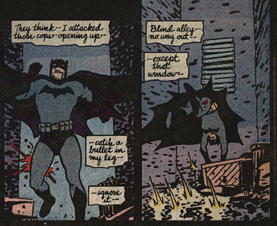
One of the things that struck me about Batman: Year One was that its world, unlike other Batman comics, was a mundane one, and Batman as a character was human-sized, vulnerable, and therefore unbelievably awesome that he could do the things he did. He didn't have batcables that could just whisk him away to wherever he wanted. He had to hoof it sometimes, and sometimes he got injured. Even as a hard-to-impress 13-year-old, I thought that something as commonplace (in comics, anyway) as Batman flipping through a window or kicking a rickety old pillar in two was completely gripping, and it was all due to the fact that this artwork firmly placed it in the real physical world.
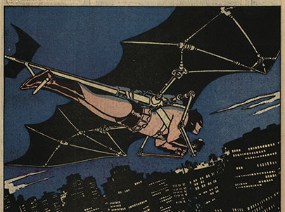
I met David Mazzucchelli for the first time about two months ago at the NY Comicon, and he was absolutely as nice as can be, but almost more importantly, he was articulate and interested in discussing the craft of comics and seemed genuinely excited about his work-- not as common a trait as you'd think for comic book artists at a convention.
Labels: Influences
Thursday, April 19, 2007
Project: Romantic is deemed Eisner-worthy.
The Eisner awards were announced today, and Project: Romantic is a finalist for "Best Anthology" !
Read the full list of Eisner nominations at ComicsReporter.com.
Industry professionals will cast their votes this spring, and the winners will be announced at this summer's San Diego ComiCon.
Labels: Media Exposure
Wednesday, April 18, 2007
Are They Brothers? Test 2
Zander Cannon and Kevin Cannon claim not to be brothers. But they both live in Minnesota, are both over six feet tall, both went to Grinnell College, and are both cartoonists. Not brothers?? Not likely!! So here at Big Time Attic, we've decided to do a little bit of extremely scientific testing to find out the truth once and for all.
This week, we go boldly where no one has gone before and take not one but three Star Trek tests. Both Cannon boys are notoriously thorough, don't you know. Hmm.
Test #1: Matthew Barr's Star Trek Personality Test
Zander's result:
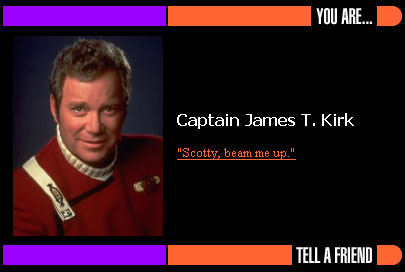
ZANDER SAYS: Sweet.
Kevin's result:
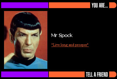
KEVIN SAYS: Spock is the robot one, right?
Test #2: Sea Breeze Computers' Star Trek Personality Test
Zander's result:
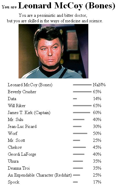
ZANDER SAYS: Really?
Kevin's result:
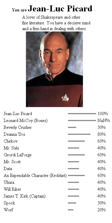
KEVIN SAYS: Wow, only 30% on Spock for this one. Having never seen the show, I can only guess from the photo that Mr. Picard is a kind and gentle older gentleman.
Test #3: Blifaloo.com's Star Trek Personality Quiz
Zander's result:
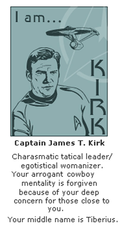
ZANDER SAYS: Yessss! And don't worry, everyone. I carry an inhaler for my charasthma.
Kevin's result:
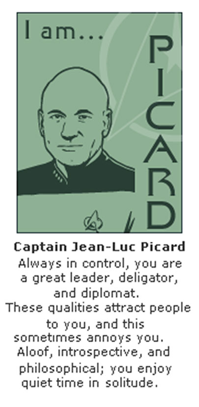
KEVIN SAYS: Third time's a charm! Picard it is!
Truly, they could not be less alike. Bold and impetuous, quiet and reserved. They're like the yin and yang of spacefaring. And they're the favorite captains! But still-- as for this experiment:
Brotherhood Likelihood: 11%
Labels: Are They Brothers?
Tuesday, April 17, 2007
Tips and Tricks: Desire
Scott McCloud came to town recently, and as part of his talk at Dreamhaven Books, he mentioned that the thing he is obsessed with now (and as we know, his obsessions can be rather intense), rather than being comic storytelling-related or technology-related, is story-related.
Every story begins at the beginning of a character's desire, and ends at the resolution of that desire.
Not the most earth-shattering notion, and I'm sure that if you've thought about writing at all you've come to a similar conclusion yourself. However, it made me think about a post I made a few weeks ago, Emotional and Logical Storylines, and the point that I was trying to make about Emotional storylines is basically summarized in that one sentence. In fact, to my mind, this notion represents the fundamental concept in creating a story.
As sympathetic human beings, we relate to a person's desire. We all desire something, and we want to help people we like achieve their desires. The presence of a likable character with a palpable desire for something is the nucleus of interest around which all stories revolve.
Similarly, it's a useful acid test for a story that seems to be losing steam. Are we still working toward the main character's goals? Does he or she still want that thing? Did he ever really want that thing in the first place, at least any more than anyone else? If so, why?
Stories in which everyone is chasing after an item that ultimately turns out to be worthless are a perfect example of why it's desire that makes stories compelling. It's the want that makes the story move, not the thing itself. And the fact that the item is worthless often helps to reveal the reasons that each person chased it, and therefore, reveals something about their character: always a plus.
Next time you write something, think about what your main character wants. Think about what your secondary character wants, think about what that guy standing there in the background wants. All of a sudden, you'll find yourself being pulled through the story and plot elements that seemed pale and perfunctory will come alive as they help or hinder your hero get where he or she is going.
Labels: Tips and Tricks
Monday, April 16, 2007
Friday, April 13, 2007
Influences: E.C. Segar
Elzie Segar was a major influence on me when I was learning to draw. I had a book of Sunday Thimble Theater reprints that Fantagraphics put out in the 80s that I read over and over and over. For one thing it opened my eyes to what Sunday comic strips used to be, and it showed me that a newspaper strip could have a whole world in it, with dozens of characters and an ongoing storyline that didn't have to use 2/3 of the strip to recap.
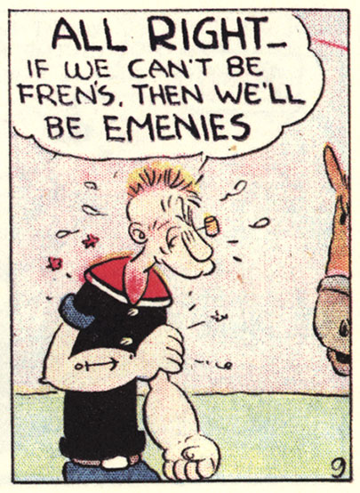
>click on panel for entire row<
Popeye's dialogue was another thing that I thought was great at a time when my whole life was school. I mean, you learn every day the proper way to say things: grammar, spelling, pronunciation, and how not to mumble, and then this hero of the comic strip throws it all out the window. How can you not love that?
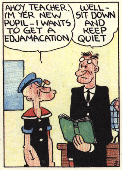
>click on panel for entire row<
From a story point of view, I loved how the basic idea was that there were a bunch of funny characters and all he had to do was put them in a situation in which they would interact and it would make a strip. Even with 12 or 16 panels to play with, each strip was about not much more than Wimpy wanting a hamburger or a duck dinner, George G. Geezil wanting to kill Wimpy, or Popeye earning and then giving away a ridiculous sum of money (the equivalent of science fiction in the Depression, no doubt).
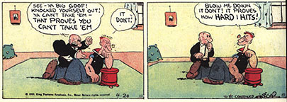
>click on panel for larger version<
Popeye was one of the first cartoon characters that I memorized how to draw in middle school so that I could impress all my peers. I can still remember the shapes and the order I drew them in to this day. So if anyone needs an artist for the daily Popeye strip, I'm available. It'll look like a 6th grader drew it!
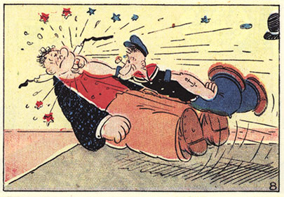
Finally, I loved the use of swooshy motion lines, stars, sweat drops, and tiny word balloons with tiny exclamation points, all to get across what more efficient cartoonists nowadays would use just a couple brushstrokes to do. The evidence of experimentation in the early comic strips has great appeal to me, and even reading them now one gets the feel that there is this vast new vocabulary of personal expression, if only we would explore it.
Labels: Influences
Thursday, April 12, 2007
Wednesday, April 11, 2007
Are They Brothers? Part 1
Zander Cannon and Kevin Cannon claim not to be brothers. But they both live in Minnesota, are both over six feet tall, both went to Grinnell College, and are both cartoonists. Not brothers?? Not likely!! So here at Big Time Attic, we've decided to do a little bit of extremely scientific testing to find out the truth once and for all.
Put on your lab goggles, and let's begin.
Test: Which Superhero Are You?
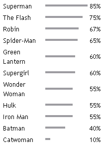
Zander's Results:
You are Superman

You are mild-mannered, good,
strong and you love to help others.
Kevin's Results:
You are Spider-Man

You are intelligent, witty,
a bit geeky and have great
power and responsibility.
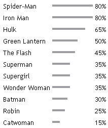
Conclusions: Kevin ranks below 50% on all of Zander's top superheroes. The case for brothers is looking grim. Plus, Kevin has 5% more Catwoman in him than Zander does. And Zander is 60% Supergirl, as well as being equal parts Wonder Woman and The Hulk. I can't see these guys being raised by the same people.
First test says:
Brotherhood Likelihood: 36%
Labels: Are They Brothers?
Tuesday, April 10, 2007
Tips and Tricks: Starting a Project
One of the hardest parts of being creative is actually getting started on a project. A lot of people who consider themselves to be creative have a lot of ideas floating around in their heads, but they find it hard to actually get going and put it down on paper. I have had this problem for most of my life, but recently I've thought about the projects I've done in the past that made me feel the most creative and tried to put together some of the things they've had in common, both things that I've done and things that have been forced on me.
Envision the Project
The second step in every project, after the general idea, is how you are going to communicate that idea. Will it be a novel, a comic book, a video game, a poem? If it's going to be a comic book, for instance, how long do you want it to be? How big do you want it to be? Color or black and white? On paper or online? Self-published or published by someone else? Try to picture what the finished project will look like in your hands. Think about the size of the pages that you've decided on; how much art fits on those pages? Think about the number of pages that you've decided on; how much story fits in that number of pages? Think about the incidental things-- the front cover, the inside front cover, the back cover, the inside back cover. Are you going to make it a wraparound cover? Are you going to put a list of the characters on the inside front cover? Are you going to put in sketches on some extra pages?
Obviously, not every one of these questions needs to be answered or nothing would ever get done, but it's good (and rare, in my experience) to have a sense for what the project is going to be like, at the very least.
Set Parameters
Sometimes these are set for you by your choice of medium, but oftentimes, when working on your own projects, there is a sense of infinite possibilities for any work. While that has its upside, it can be crippling when it comes down to the nuts and bolts of getting things actually done. In this day and age, with computer colors, print on demand, online publishing, non-standard formats, and the convergence of media, the idea of formatting to the requirements a certain medium seems awfully quaint. But you know what? You have to commit sometime, so let's hear it, champ. You may decide you're going to do a ten-page story. You may decide you're going to do a 24-hour Comic. You may decide you're only going to use a certain kind of pen. You may swear up and down that you're going to do one comic strip a day for a year.
Whatever it is, it's your track now, and for all the times that it will feel constricting, there will be just as many times when you are so glad that you have a clear path to funnel your energy, be it high or low, into.
The genesis of the 144-hour Graphic Novel Project was built around wanting to create a graphic novel in a year and fit it into the schedule of someone who works full-time. Therefore, a number of tight parameters had to be set. We chose to emulate the 24-hour comics' page-an-hour pace, which demanded such things as simple tools, a very very loose story outline, working at published size, and for me, relatively unvaried page layouts. These rules, rather than limiting the creativity of the project, shape it, and make it into what it is.
Set Aside a Time
Along the lines of setting parameters, it's important to set aside a failsafe, foolproof time that you will always be able to work on the project with no interruptions. This is important. This deserves a time in your day. If it's every day before you go to work, or every day when you come home before you eat dinner, or an hour before bed, or during lunch. If you set it up, let people know what you're doing, and follow it, then you end up getting the work done. If you choose poorly (e.g. at a time when you have other things going on) or fail to make it a priority (do everything else that comes up instead of work on your project), you will not. Obviously, things come up, but it's important to think about that as a reason to carve out extra time here and there to finish that month's work so you can go into the next chapter with your head held high.
Do NOT fall into the trap of "just working on it when I have the time". That makes it your last priority. Unless you have absolutely nothing going on in your life, I'm sorry to say it will not work.
Don't Do a Bad Job
This may seem obvious, but it's a very fine point. A lot of times when you have an idea in your head for some project you want to do, you expand it in your head until it is so great and wonderful that nothing you could do (at least the first time around) could ever match it. This keeps you from doing it because you love imagining it in perfect form so much. This is Brain Crack.
Now, that's not to say that you should just throw every undigested idea you ever have out there for the world to see, but what I find to be useful is this simple guideline: Don't Do A Bad Job. Decide what you are going to do, set your parameters, put aside some time, and then try your very best not to suck. If that's what you're focusing on, you'll be remembering to develop your characters, have your dialogue sound good, choose your panel design carefully, and draw your characters consistently and well. Worried that the work might just be okay, and not pure genius like you hoped? I wouldn't. Just like running at an even pace throughout the race puts you in position to sprint and win at the end, taking care of the basic, average stuff puts you in the position to have moments of genius come through when they will be most appreciated.
Come on. I know you've got it in you.
Labels: Tips and Tricks
Monday, April 09, 2007
Friday, April 06, 2007
Influences: Alan Davis
It's hard to overstate how much of an influence Alan Davis was on me as a teenager. From Detective Comics to New Mutants, Excalibur to D.R. and Quinch, he was one of the perfect artists (David Mazzucchelli was the other one; he will be the subject of a future post).
Alan Davis' art had a cartoonishly clean feel and an instinct for humor that I found refreshing in a time when every artist was trying to copy Frank Miller's grim (but admittedly awesome) art style. I first came upon Alan Davis' stuff in Detective Comics #574, in which he rushed a wounded Robin to the clinic in Crime Alley. Conveniently enough, the clinic is right across the street from the corner where his parents were killed years before, and he spontaneously recalls his entire origin.
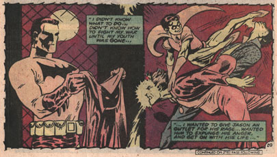
It's grim stuff, as code-approved 80s superhero comics go, but the smooth style and lighthearted physical comedy makes it not only more palatable to a young audience, but also makes it more "real" in relation to the Batman world, which exists happily removed from the complexity of the REAL real world.

At that time, Alan Davis' art was being inked exclusively by Paul Neary, whose economical linework and bold outlines gave Davis' work a weight and depth that made it both cartoonishly appealing and heroic all at the same time. Since the late nineties, Davis has been inked by Mark Farmer for the most part, and although it's beautiful work, and the heroism is still there, it is a more laborious and detailed inking style, and it lacks some of the humor and elegance of his earlier work that appealed particularly to me.
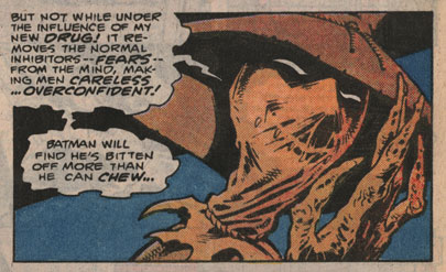
What I liked also about this work as a young cartoonist is that, with relatively few brushstrokes, it communicated multiple light sources on such things as hands or leather jackets. At the time, I didn't have the skills to reproduce it properly, but I loved the fact that he did such a good job making the physical objects look so solid and powerful, as well as making them look like they fit into the lighting of the panel.
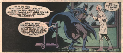
Davis' storytelling is exemplary as well; he makes a point to widely vary the size and shape of his panels, as well as the size of the subjects within them, so that the page has a nice combination of visuals that work as both story and design. By often using borderless panels, he draws attention to the physicality of his subjects, entirely apart from their backgrounds, which, for an adventure series like Detective Comics or Excalibur, works extremely well.
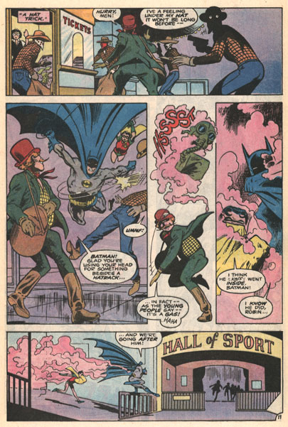
Alan Davis showed me that there was something to be said for lighthearted art in a world of comics and superheroes that were turning darker and darker by the minute. He also showed me that that semi-cartoony work can nevertheless be powerful, heroic, and thrilling. That sort of combination was something that I tried to emulate pretty much every day since then.
Labels: Influences
Thursday, April 05, 2007
Wednesday, April 04, 2007
I Wish Someone Would Invent: A Cleanable Keyboard
Have you ever thought about an invention that maybe YOU can't make, but it sure would be nice if someone else did?
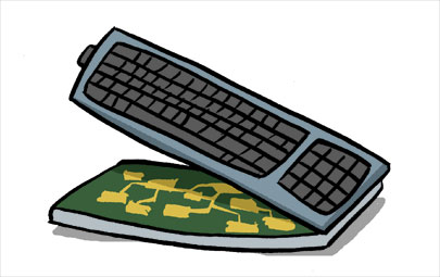
I wish someone would invent a keyboard that you could easily unlatch and open up, wipe off all the dust, dead skin, muffin crumbs, Mountain Dew, and microbes, and then close it up, nice and easy. You wouldn't have to take out all of the keys, or crack open any warranty-voiding seals, just open, wipe, close.
I'm sure you'd have to make sure there was an effective connection between the physical keys and the corresponding circuits that went across the flat barrier. Undoubtedly that would be a little more tricky than the way most keyboards are made now, but I'm sure there are companies that have cleanliness needs that are more extreme than mine and they could come up with something.
So, you want to invent it? Already know about something just like it? Got a reason why it would never work? Got some suggestions? Got your own "I Wish Someone Would Invent..."? See you in the comments!
Labels: I Wish Someone Would Invent
Tuesday, April 03, 2007
Julia Vickerman Animation Interview on Frederator
Read an interview with BTA-turned-Puny animator Julia Vickerman on her creative process behind her hilarious animated short, Dealing With Women.
Read the Interview on FrederatorBlogs.com
Watch Dealing With Women on AtomFilms.com
Labels: Friends of BTA
Tips and Tricks: Emotional vs Logical Storylines
Along the lines of the Story Triangle, this is another shorthand that I like to use when writing. It's something easy to keep in mind, and it really helps keep stories interesting without losing focus.
Every story that you read has both a logical storyline and an emotional one. For the purposes of this discussion, let's think of the logical story as the framework of a highrise building-- the beams and girders. The emotional storyline is the walls, paint, carpet, and decorations. Obviously, to make a building that anyone wants to live in, we need both to work properly. Not enough emotion and we're walking around in a construction site with howling winds and rain pelting us. Might be interesting to see how the building is put together, but you wouldn't want to spend much time there. On the flip side, if you don't have enough logic, you get the Winchester House. Beautiful, but there's only so many times you can open a door to a brick wall or a three-story drop before you just want to get the hell out of there.
Creating Storylines: Logical
When creating a logical storyline, all that really is required is that it make sense, and there are no gaping plot holes. Anything that makes your audience go, "Yeah, right" is immediately suspect. If your story involves someone breaking into a tightly secured area, do the security measures make sense from the point of view of the people who made them? For example, in the movie Mission Impossible, Ethan Hunt has to get information from a computer without touching the floor or raising the temperature of the room. Very exciting. However, don't you think it would be easier to apply an alarm system to the keyboard or anywhere else on the computer than to the floor or the thermostat?
Another point is that it is important not to make the plot too convoluted. It may make sense in a timeline framework in your notes, but once you add characters and emotions, you're going to find yourself either catching people up with dull exposition scenes or making the story twice as long as you intended.
It would be easy to think that the logical storyline is all that is required of a story. The plot has its sequence; the problems are presented, and then they are solved. But it will read like a history book if you don't inject it with some heart.
Creating Storylines: Emotional
When I'm writing, I like to lay out my logical storylines (keeping them pretty sparse, of course), and think of them only as sequences of events, assigning a character's emotions in that scene only when it's unavoidable. In the case of an ensemble episodic storyline, with a great number of characters, I like to keep it vague in the plotting stage who's going to be the focus so that I can change it later if I feel like someone else will work better.
Laying in the emotional storyline is less detail-oriented than the logical storyline, but the tradeoff is that the action has to consistently flow and build to a climax. The character or characters you focus on have to go through a change in order for the story to be worth telling (of course, other variations are that a mysterious or uncommunicative character is gradually revealed, or that a relationship between two characters develops rather than their individual personalities). A story without a character growing will play out as being rather flat. A reader or viewer might look back on it and note how well it was plotted, or how wonderful the world it inhabited was, but it will be ultimately a little unsatisfying. To give another movie example, in The Peacemaker, a very well-plotted, well-shot spy/military movie, the climax occurs when the two protagonists have to disarm a bomb in a church. They have both used all of their skills and ingenuity to track down the bomber and tinker with the inner workings of the mechanism. But there was no particular growth or change in either character, either during or after. They are highly trained specialists, and they used their respective skills to accomplish their mission. Big deal. I actually quite enjoyed the movie, but it left me just a little cold in that way. Think about that the next time you see a movie or read a book or comic that was good, but somehow didn't satisfy. Did the main character grow or change, or did he/she stay exactly the same?
The emotional storyline, in many cases, is completely detached from the logical one. In episodic works (like TV or serialized comics) the plot may stretch on for many many chapters, while emotional plots are tied up relatively neatly in each episode. This makes for satisfying viewing or reading without having to come up with a tightly plotted mystery to weave every single time.
The bottom line it this: The logical story keeps things structured, makes sense, and is believable. It allows people to tolerate your story. The emotional storyline, on the other hand, is what makes things exciting, mysterious, or charming. It is what will make people love your story. And isn't that what we all want?
Labels: Tips and Tricks
