Portfolio Review: Mismatched Perspective
Summertime! The summer convention season is a great time to take your portfolio to all the comic conventions and show your stuff. I've done many a portfolio review for many a young artist, and I frequently feel as if I'm saying the same things over and over. This isn't the young artists' fault-- but it's a direct result of there being a great many common errors that people make in their portfolios. If those could be addressed en masse, perhaps we could more quickly move along to the particular errors (and triumphs) of each portfolio. So if you're thinking of showing your comics or cartooning portfolio this summer, either to professionals or to editors, watch this space for common mistakes and how to correct them.
Common Mistake #1: Mismatched Perspective
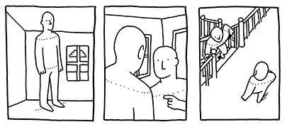
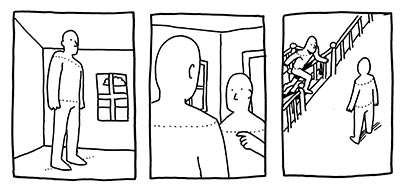
I often see young artists that are in most other ways fairly accomplished that make the mistake of not incorporating their characters into the perspective of the background. I gather (from my own experience) that it's because people are hard to draw, and you learn how to draw them first from only a couple perspectives, and then, in the interest of making the best-looking drawing you can, you try to shoehorn that person into a background that's not quite right.

Always remember that people are subject to perspective just like everything else, and in almost all cases, they want to have their heads and shoulders level. I know, I know, it's an action comic. But unless your character is doing backflips, dodging bullets, rolling under spinning blades, or some other such thing, he or she is probably going to be standing up relatively straight. Here are some preferable solutions to the problem.

Keep in mind that a solution is always available via photographs. Take a quick photo of a friend or of yourself doing what you want your character to be doing, and then-- don't copy it, but absorb it. Think about where all the arms and legs are, what angle the head's at, what angle the shoulders are at, etc. Try drawing it from another perspective. Draw it using only the simplest shapes and stop worrying about the folds of the fabric. Need some action shots? Get a kung-fu movie on DVD and frame-advance through an action scene. Draw those! You're not only guaranteed to get accurate poses, you're likely to find some far more expressive and non-cliched ones as well.
Got some perspective-related portfolio tips, cartoonists? Got some questions for the cartoonists, young students of comics? Join us in the comments.

2 Comments:
very usefull post. thanks.
i gess i have just the problem you mention, but that´s a tuff one to resolve, it´s a matter of really drawing more and accepting what may come. tuff to some, fundamental to all!
I found the tips very helpful. I am always watching cartoons and observing how the artist handels the situation. The article put into words and better describes what i need to improve on
Post a Comment
<< Home