Cartooning Tips and Tricks: Crosshatching
Crosshatching is the layering of planes of parallel lines on top of each other in order to create a gradient or texture in a drawing.
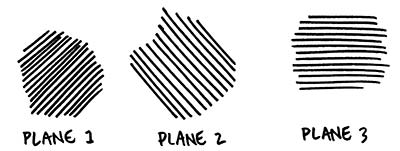
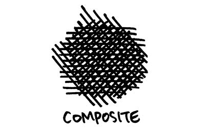
Crosshatching has an "old-fashioned" stigma, probably for good reason: drawing lines side-by-side, and then on top of each other, is a great solution to a problem inherent in pen & ink drawing and printmaking: How do you make a drawing tonal if all you have to work with is black and white?
With digital tools at our disposal, as well as relatively new products like Zipotone, Craftint and DuoShade, it's easy to see why crosshatching isn't considered cutting edge. However, I don't personally believe that a technique in itself can be old-fashioned; I think that comes out of how the artist uses the technique.
Below is a primer on crosshatching for the beginner or for those who want to hone their craft. Professionals -- we'd love to hear your advanced tips and tricks in the comments!
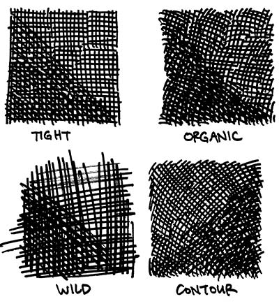
Styles of Crosshatching
1) Tight, accurate lines. Plane 2 is arranged at 90 degrees, plane 3 at 45 degrees.
2) Organic lines. Gives a softer feel.
3) Fast, wild lines. Energetic and frantic.
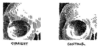
4) Lines that follow the contour of the surface.
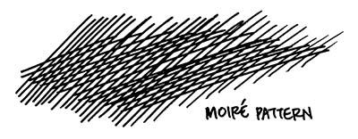
Moire Pattern
When an overlapping plane doesn't have much of directional shift from the plane below it, you can end up with an effect like below. It looks jarring and will take attention away from your drawing.
Contours
When drawing a 3D object like a skull, do you keep your lines straight or follow the contours of the object? Examples:
Gradients
Two kinds of gradients below. On the left, the planes of lines end abruptly, in chunks. On the right, however, there is a greater attempt to smooth the transistion through the use of small lines that "dissolve" from one plane into the next.

Consistency
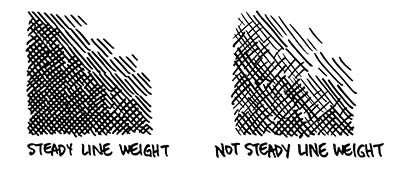
There is no right way to crosshatch, but being consistent in whatever style you choose can go a long way towards making your work look competent.
Consistent line weight. Keeping a steady line is easier with an inflexible tip pen like a rapidograph. If you're using a flexible crow-quill nib, however, keeping steady line weight will be a chore.
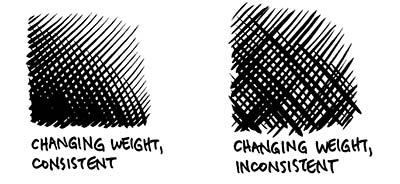
However, consistency and a changing line weight can go hand in hand, but takes concentration:
Labels: Tips and Tricks

7 Comments:
This is a great little tutorial. I just wish I could keep my line spacing consistent. I assume that just takes lots of practice.
Hi. Thanks for this tutorial. I've spent 4 years in art college but they didn't teach us how to do this =/
I didnt know about crosshatching till senior year in high school :)
but this is very helpful. And yes, it is a bit of work to keep spacing consistent. But at the same time, there is no "right way" of art style or form
for spacing consistency I have found it is more in the hand and less in the mind if that makes any sense.
yall are dumb. i learned cross hatching in elementary school. and for the person saying they spent 4 years in art school without knowing this...well, that means your probably never going to be any kind of artist and your school sucks. cross hatching is common sense, plain and simple.
Charles, you are a troll.
lol
Post a Comment
<< Home