Tips and Tricks: Atmospheric Perspective (Color)
Atmospheric perspective is the effect that you see when looking at objects of varying distances from you. Namely, the farther away you are from an object:
1) the hue of the object becomes increasingly blue, and
2) the contrast of the object decreases.
You can read about the science behind atmospheric perspective at Wikipedia.
As a cartoonist, you can mimic the effect of atmospheric perspective in order to create or accentuate depth in your drawing. Because atmospheric perspective is universal (among earthlings, anyway), you can use this trick in pretty much any context without confusing the reader.
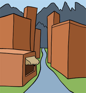
Here is a generic drawing of a small street in a mountain town.

The objects in the drawing all suggest that there is a great deal of space between them. Using logic, we know that the mountain range is very far away. We see the street narrow as it moves up the panel, suggesting that it is moving back in space. We also see buildings layered on top of each other, also suggesting that they are moving back in space.
So why does the panel still seem so flat?
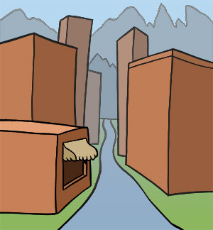
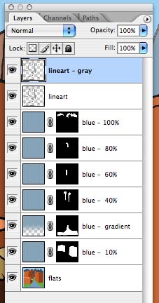
Watch what happens when I put a blue mask over the objects in drawing. The opacity changes from 10% to 100% as the objects move back in space.

Trick #2: Decreasing Contrast
Here I'm messing with the lineart layer, changing the black lines to gray as items recede.


You can also create the illusion of distance in black & white drawings, which Zander will talk about in an upcoming "Tips & Tricks" post.
Labels: Tips and Tricks

0 Comments:
Post a Comment
<< Home