More Saucy
We went down to check out the opening of Saucy (the burger joint we concepted, named, designed etc. etc.) and get some shots of the real-deal food to use in promotional stuff. The food was really good (best onion rings I've ever had) and people are really digging the build-your-own-burger concept and the design. We also got some nice comments on the menu boards and people often stopped to watch the videos as they were walking by.
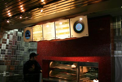
Here is the completed menu board.
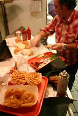
We set up shop in the old Steak Escape space, which felt post-apocalyptic, and after some cleaning and rearranging made a pretty decent food photography set up. Here Vinny is putting together some good looking burgers and chicken sandwiches.
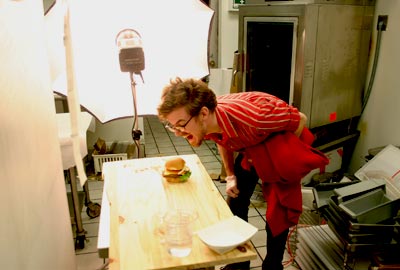
Tim is tough on the talent. His drill seargent like approach intimidates most models but the ones that can take it move on to become super-stars.
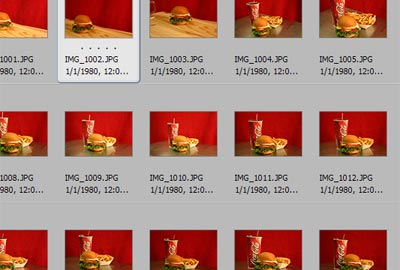
We take a ton of pictures in hopes of getting a few good ones. It's a lot of trial and error. We don't have an army of food stylists with weird inedible materials, so we're not looking for perfection...delicious but real.
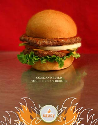
This design is a poster that's going to be hung up around the mall. The burger is sitting on a Steak Escape prep table and the red backdrop is an old Wisconsin Badgers blanket that was in the back of Brian's truck.

4 Comments:
Very cute hamburger. I love its little pickles.
And that blanket looks very clean after having come out of the back of a truck.
Hello, I've been following you guys (BTA) for a little while, and really love the creativity and fun of your designs. I'm working on Curbly.com, an online community for people who love interior design, and I was hoping you'd be interested in checking it out. We're in a closed beta period now, but I'd be happy to send you an invitation (bruno AT curbly DOT com) .
Thanks!
BB, I love interior design, I'm just really bad at it. Shad HATES my kitchen. Will your site give me some ideas?
I stopped at Saucy on my way to Minneapolis and have to say that the burger was quite tasty.
Post a Comment
<< Home